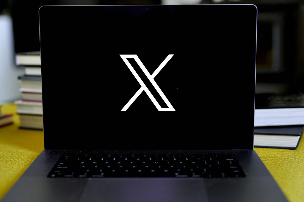
Twitter—now called “X"—is undergoing a makeover, complete with a new logo that has drawn some criticism. Elon Musk, who bought the company for $44 billion last year, unveiled the “interim logo” on July 23 after teasing its arrival earlier in the day via Twitter.
A simple san-serif X with two strokes, one of which is outlined, the new logo replaced Twitter’s iconic bird on Monday. Musk has referred to its style as “Art Deco.”
While the design’s origin has not been confirmed by Musk or Twitter, many Twitter users have speculated that the logo was potentially sourced from Fonts.com, or is a slightly modified unicode character (“𝕏” (U+1D54F)), or was taken from a logo design of a podcast that was sent to Musk.
The design, criticized for being overly simplistic, prompted widespread mockery, with users online creating their own parodies.
Jan Šabach, a graphic designer and creative director of the design and brand consultancy Code Switch, says the new logo appears to lack a coherent strategy or represent a clear idea. “The technicalities of the logo and the branding strategy to execute it has seemed non-existent,” he tells TIME.
More From TIME
To Šabach’s design-keen eye, the current X logo is not only “optically misaligned” in its design, but takes a haphazard, speedy approach to transitioning out of such a distinctive original look. “In branding when you’re rolling out a new identity you have to be very cautious and careful with how you do that,” he says. “They’ve done no hand holding or explaining.”
According to Šabach, Twitter’s original logo worked because it was well proportioned in all sizes, geometrically aligned, and had a “softness” to its personality that recalled the brand. “There’s nothing unique about the X. It’s cold and pointy,” he says, adding that users who see an "X" may connote it with exiting the app, instead of logging on. "It's not exciting."
Martin Grasser, one of the original designers of the original blue bird logo, said goodbye to his co-design in a Twitter thread on July 23, writing that it was “designed to be simple, balanced, and legible at very small sizes, almost like a lowercase ‘e.’” Grasser’s meticulous design process included hand drawing birds, constructing drawings over circles, and “perfecting every little detail” to give a real bird appearance.
Musk says he wants the rebranding of X to help it become an “everything app” and that the logo “certainly will be refined” in the future.
More Must-Reads from TIME
- L.A. Fires Show Reality of 1.5°C of Warming
- Behind the Scenes of The White Lotus Season Three
- How Trump 2.0 Is Already Sowing Confusion
- Bad Bunny On Heartbreak and New Album
- How to Get Better at Doing Things Alone
- We’re Lucky to Have Been Alive in the Age of David Lynch
- The Motivational Trick That Makes You Exercise Harder
- Column: All Those Presidential Pardons Give Mercy a Bad Name
Write to Mariah Espada at [email protected]